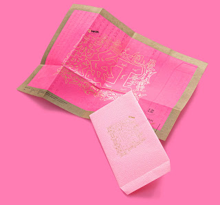
府城紅 HÚ SIÂNN HOME 展覧主視覺設計
府城紅 HÚ SIÂNN HOME
★2020 TAIWAN TOP STAR視覺設計獎-識別設計類/社會組/評審特別獎
★2020臺南設計獎-實務組/佳作
強調傳統文化再創設計的展覽特色,將展覽名稱「府城紅」三個中文字以傳統民俗版畫字模字版樣貌,刻意只保留線框風味呈現,外圍加入以”壽字圖”及當年份”庚子”字樣互相搭配點綴出”紅色”在傳統文化中有著健康與長壽的象徵,構成展覽活動主視覺設計。色彩上以桃紅及金兩色來強化這是一個與紅包、年節喜慶主題相關的展覽。
指導│文化部
主辦│臺南市政府文化局、臺南市美術設計協會
特別感謝:「臺南市美術設計協會」設計邀請及全體會員的辛苦努力付出
#職人設計 MMD 協助作品攝影
This exhibition emphasizes the redesigned characteristics of traditional culture. In particular, the three Chinese characters of the exhibition title "HÚ SIÂNN HOME" are presented in the form of traditional folk prints, and deliberately retaining only the frame of the words. In addition, the image of "shou”, and the word “Gengzi”, the name of the current year, are added to embellish the color "red", a symbol of health and longevity in the traditional culture, which constituted the main visual design of the exhibition. The colors pink and gold are used to indicate that this is an exhibition related to the theme of red envelopes.


留言
張貼留言